Machine Learning-Driven Analysis of AFM Force–Distance Curves for Cell Membrane Integrity Assessment
Markéta Barać-Makarová, Tomáš Pompa, Zdeněk Farka, Jan Koláček, Ondřej Pokora, Jan Slovák, Monika Pávková-Goldbergová, Jan Přibyl, Radka Obořilová
March 09, 2026
Loading webR, please wait...
1 Upload data
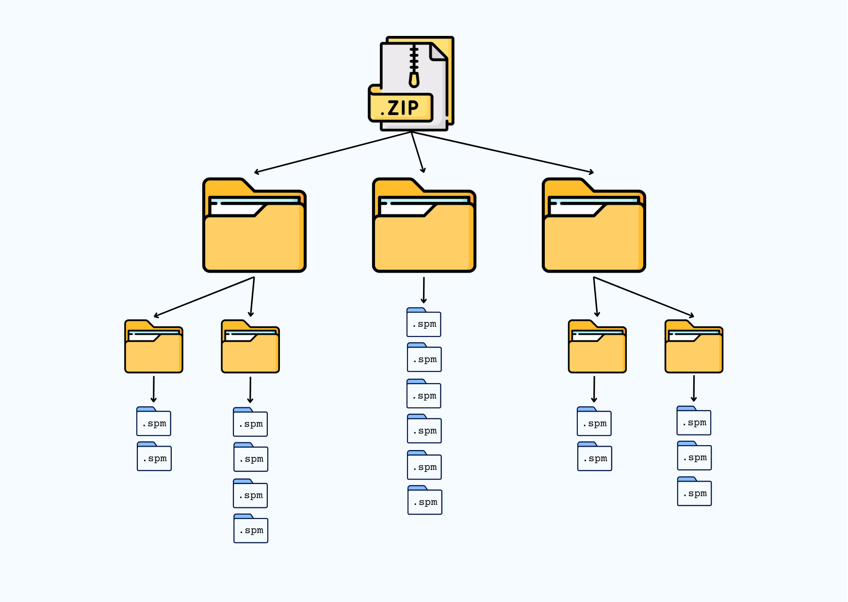
We start the analysis by uploading data. They must be stored in a ZIP file with specified structure.
1.1 Upload and extract the ZIP
Start by uploading your ZIP file containing the datasets. The structure of the ZIP file must be similar to the picture below.
The ZIP can contain multiple folders; for example, typical folders are Before and After.
Once uploaded, the files will be extracted into the webR virtual filesystem and the main folders will be listed below.
Select a ZIP file with your data:
No ZIP data uploaded yet.
First-level folders:
Loading...
1.2 Upload files into R
Now, by clicking on the button below, all the files will be uploaded into R memory. To check that everything is OK, the numbers of curves within each first-level subfolder will be displayed.
No files uploaded yet.
1.3 Define parameters
Before we start to analyze the uploaded data, we define some useful parameters:
How much of the curve is cut off:
(default value 0.5)
If the data are sparsely sampled, resample the data
(default value 5)
times.
How many points in a row must increase or decrease to label a point as a peak:
number of increasing points:
(default value 10)
number of decreasing points:
(default value 5)
minimum peak height proportion:
(default value 0.05)
How many points in a row must increase or decrease to label a point as a dip:
number of increasing points:
(default value 30)
number of decreasing points:
(default value 10)
Smoother span value:
(default value 0.0001; proportion of nearby points affecting the smooth; larger values increase smoothness)
Distance-based interpolation threshold:
(default value 5; acts as a skip distance - increasing it reduces the number of local regressions performed via lowess() function, replacing them with faster linear interpolation)
When searching for the contact point using the AFMToolkit package:
first multiplier for the noise threshold:
(default value 1)
second multiplier for the significance threshold:
(default value 10)
Attempt localizing peak point window before peak search?
Waiting for initialization ...
2 Data classification
Now, we classify the curves.
2.1 Classification of the curves
If you want to classify your curves, press the Classify button below.
Waiting for initialization ...
2.2 Plot the results
We can visualize the classification results by a plot of prediction distribution per method.
or
.
2.3 Export the results
We can also export the classification results into a csv file.
3 Curve metrics
In the last chapter, we use the classification results from the selected model (see below) and compute curve metrics. Next, we plot the curve according to the users choice.
3.1 Select the final model
According to the previous results, you can choose the model to be used for metrics calculation.
Moreover, you can choose which method should be used for contact point searching.
3.2 Compute curve metrics
Based on the selected model from the previous section, we compute some curve metrics (press the Compute metrics button below).
Waiting for initialization ...
We can also export the classification results along with the computed metrics.
3.3 Plot individual curve
Finally, we plot an individual curve with annotated peaks, contact points and dip points.
Select a curve to be plotted
From the dropdown menu, select a curve to visualize.
or
.
Waiting for initialization ...
New contact point index: .
In order to overwrite the current contact point index and corresponding metrics, press
.
In order to overwrite
all contact point indices
and corresponding metrics, press
.
Finally, you can download the classification results with corrected metrics: .